Pit-Fighter
Description official descriptions
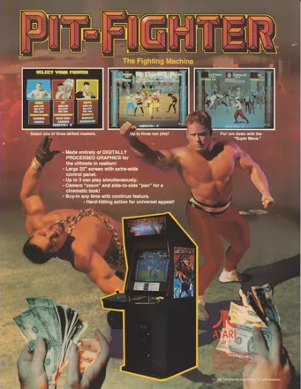
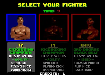
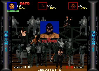
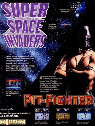
Pit-Fighter is a 3rd-person fight game that features digitized graphics of real fighters and zooming effects. Players select one of three fighters (Buzz, Ty or Kato) to take on anyone who dares. At the conclusion of a match, players are individually awarded a Knockout Bonus, Brutality Bonus, and a Fight Purse. Every third match is a Grudge Match where players test the skills of each other. The last man standing is the winner of this three-knockdown match. Players fight their way to the Elimination Match to decide who wins the opportunity to dethrone the champion, the Masked Warrior.
Spellings
- ピットファイター - Japanese spelling
- 피트 파이터 - Korean spelling
Groups +
Screenshots
Promos
Credits (Arcade version)
43 People (32 developers, 11 thanks) · View all
| Buzz | |
| Ty | |
| Kato | |
| Executioner | |
| Southside Jim | |
| Chainman | |
| Mad Miles | |
| Heavy Metal | |
| C.C. Rider | |
| Angel | |
| Masked Warrior | |
| Knife Woman | |
| Knife Man | |
| Finale Women | |
| Project Leaders | |
| Project Designers | |
| Programmers | |
| Digital Imaging | |
| Engineers | |
| Lead Animator | |
| [ full credits ] | |
Reviews
Critics
Average score: 59% (based on 53 ratings)
Players
Average score: 2.3 out of 5 (based on 111 ratings with 6 reviews)
The Worst Licensed/Fighting Game on the SNES.
The Good
Can't find anything
However techinically:
- Not as bad as Hong Kong 97
- Proof that Shaq Fu isn't the worst fighting game
- Reason to make a website called 'destroypitfighter.com'
- That's it.
The Bad
Oh boy, where do I begin?
- Your health doesn't regenerate, so if you didn't somehow beat the first enemy with 75+ HP, you're pretty much screwed.
- Remember that 'Genesis Does What Nintendon't' campaign. It's bullshit. I've checked everything and the SNES is pretty much better in every way (except graphics). However, Pit-Fighter on the Genesis is way better than this pile of trash.
- Shaq Fu (a game that's just bad, not horrible) has a website dedicated to destroying copies of it, while Pit-Fighter on the SNES (A game so bad it makes Shaq Fu look like Super Street Fighter 2) doesn't.
The Bottom Line
2/10.
Absolute Trash. I'm being generous with the score too.
SNES · by JDomarus · 2023
The Good
For starters the game takes place on illegal streetfights and I do mean illegal, with nice touches like weapons, chairs and other stuff to use against your opponent, you also have some power-ups around and the fights can include multiple opponents which is why the 2-player cooperative gameplay is a nice addition. The crowd also joins in on the excitement and for the first time in any game I've ever seen they can hit you or push you back if you get too close to them, pretty cool idea.
Noteworthy for the game are the crude but eye-catching digitized graphics, which were a first for a 2D fighter and predate even Mortal Kombat by some time.
The Bad
Everything. And that which wasn't crap on the original arcade version was made crappier on this PC port.
For starters you have only 3 fighters, and they are the same typical boring characters one associates with this type of games: the beefed-up powerhouse, the fast martial artist, and the "guy in-between" which in this particular case is practically identical to the martial artist but slightly stronger. The game has a barely readable life bar which is depleted in a nanosecond and (get this) doesn't refill between fights!! That's right, so the whole game is like this gigantic "survival mode"... cool, uh? The special moves are non-existant and the control scheme is slow and unforgiving which makes the already slow gameplay even more boring... but that's on the arcade version, when Pit Fighter got ported to the pc it got even worse! And the graphics and sounds were completely trashed, specially the graphics which for some odd reason are all vertically-expanded and seem to have lost half of the already few frames of animation they had.
The Bottom Line
Stay the hell away from this stinker, ok? Get out NOW!! Run Fool, RUUUN!
DOS · by Zovni (10502) · 2003
A bad game, but with an attitude!
The Good
The intro with the digitized meatheads! :-D
The Bad
A whole lot, but especially its brief duration.
The Bottom Line
This beat em-up is a conversion of the homonymous Atari’s coin-op arcade game. It introduces us to the cruel and brutal world of the illegal sport of Pit Fighting. Our goal is to win the championship and make money in the process. There are three available fighters to choose from: Buzz, Ty and Kato. They excel in power, agility and speed respectively.
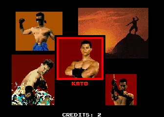
Probably the best part of the game is the introduction. Here, with a nice tune playing in the background, the three challengers demonstrate themselves: Buzz clashes the heads of two of his opponents together, then he shows off his muscles and does some weightlifting. Ty is doing crunches, eliminates a foe with a kick in head and afterwards relaxes with some feet stretching and some rope jumping. Kato neutralizes an attacking enemy blindfolded, meditates on a hill top, smashes a block of ice and spins a wooden sword.
After we choose our contestant we enter the pit. There, we will face eight lethal competitors. Let’s meet these distinguished citizens, from the eighth in rank and going up:
‘The Executioner’ occupies the last place. The only thing that will get executed is his will, for he is not much of a challenge.
Then we have ‘Southside Jim’, he is small and fast. Apparently, he fights to cover his mother’s medical expenses. He is probably the reason for them.
There is also a female participant. Her name is ‘Angel’ and she should reconsider her manners and dressing style.
Next is ‘Mad Miles’, he is a Vietnam veteran. He is also mad. ‘CC Rider’ is the biker with the unknown past. Maybe we don’t miss anything important after all.
In the third place we see ‘Heavy Metal’. He is definitely not music for our ears.
‘Chainman Eddie’ has an eccentric taste in jewelry. He is also the champion’s henchman, like he needed one.
‘The Ultimate Warrior’ is the unbeaten champion with the original name. He is the one we have to overthrow.
The graphics are badly designed and extremely poor. Both the animation and movement of the fighters are spasmodic and unconvincing. There is a small number of different locations where the fighting takes place. Only the absolutely necessary elements are graphically represented and even these in a moderate way (e.g. The crowd that watches the fight are black and white figures). The one interesting feature of the graphics is that the sprites of the characters are digitized from real people, definitely something innovative for the period of release. The only music available is the introductory theme playing tirelessly, over and over. Sound effects are almost none existent. Note that we have to choose which one of the two we will hear during playing.
Vigorous player activity is highly important in this game. Victory in battles will come as the result of mechanical and extremely fast pressing of keys. The challengers have four attack moves, one of which is a ‘special move’ that inflicts more damage. Every character has a six-square energy bar, when a square is exhausted he faints for a little. During this time he is vulnerable to enemy hits. He can also be picked up from the floor and get thrown around. The three energy bars in our disposal prove more than we need to finish the game easily, in less than half an hour. Around the pit, some useful objects are placed: A knife for stabbing. A stick for beating. A barrel, some throwing stars, and a motorbike(!) for launching against our enemies. Also, in one level there is a power pill that enhances our fighting performance. It is crucial that we use these items because they give a winning advantage. After every two matches we participate in a ‘grudge match’, where we have to achieve three knockdowns against one of the initial trio of challengers. Out of lack of fighters, we will fight against ‘Angel’, ‘Southside Jim’, and ‘Chainman Eddie’ twice. We must win in the necessary twelve matches to be declared champions. Two-player game is supported, but it finally comes down to a key pressing contest that quickly gets pointless.
“Pit-Fighter” is a traumatic gaming experience. There are much better representatives of the genre to try, so you may not want to be distracted by this one.
DOS · by Iron Lord (40) · 2016
Trivia
Cancelled Atari 7800 version
Atari had a 7800 port underway, outsourced to Imagitec Design, but abandoned it around 1992. You can read about it here.
DOS version
The DOS port of Pit-Fighter inexplicably uses a sprite resizing algorithm that stretches only vertically, not horizontally. This results in very odd-looking "skinny" fighters onscreen (as well as almost everything else).
Awards
- Commodore Format
- July 1993 (Issue 34) - Modern Classics: Beat-'em-ups (Check 'em out)
Information also contributed by Игги Друге
Analytics
Upgrade to MobyPro to view research rankings and price history! (when applicable)
Identifiers +
Contribute
Are you familiar with this game? Help document and preserve this entry in video game history! If your contribution is approved, you will earn points and be credited as a contributor.
Contributors to this Entry
Game added by rcoltrane.
SEGA Master System added by Bock. ZX Spectrum, Atari ST added by Martin Smith. Commodore 64 added by festershinetop. Arcade added by Pseudo_Intellectual. Antstream added by lights out party. Amstrad CPC added by Katakis | カタキス. Game Boy added by quizzley7.
Additional contributors: Trixter, Alaka, formercontrib, j.raido 【雷堂嬢太朗】, Garcia, Rik Hideto, FatherJack.
Game added April 2, 2000. Last modified July 20, 2024.


