Noctropolis
Description official descriptions
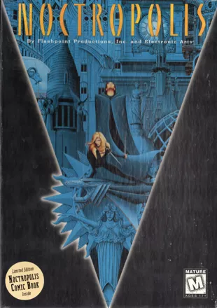
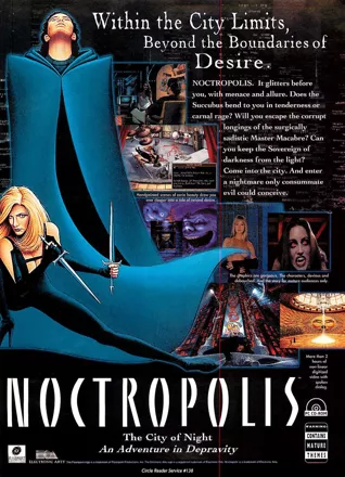
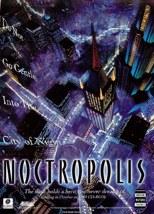
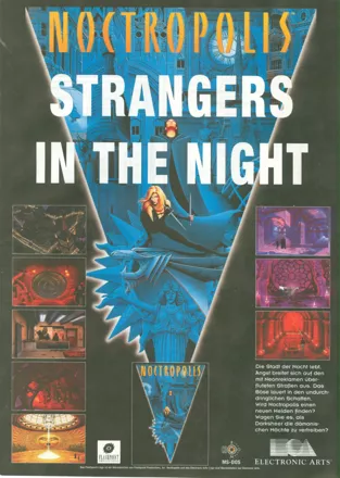
Peter Grey is a lonely bookstore owner who also happens to be a huge fan of the "Darksheer" comic book series. Darksheer is a Batman-esque superhero: one who doesn't have any actual superpowers, triumphing over evil thanks to his inventiveness and courage. Together with his partner Stiletto, a former supervillain converted to the side of the good guys, he is the sworn protector of Noctropolis, a city where it's always night time because of a permanent ash cloud that hangs over it, the result of a volcanic environmental catastrophe which occurred decades before.
One night, as Peter is leafing through the newest issue of "Darksheer" to hit the stands, a courier brings him a package which eventually transports him into the city of Noctropolis, where he has to take the role of Darksheer himself. Coincidentally enough, his arrival as Darksheer occurs at the same time as five of the superhero's deadliest arch-villains decide to gang up on him after they are mysteriously released from incarceration. It turns out that the real Darksheer had disappeared several weeks prior to Peter's arrival. It's up to the unlikely hero to find out who released the criminals, while simultaneously trying to keep them from wreaking havoc across the city of Noctropolis - and maybe, in the process, find a way back to the real world.
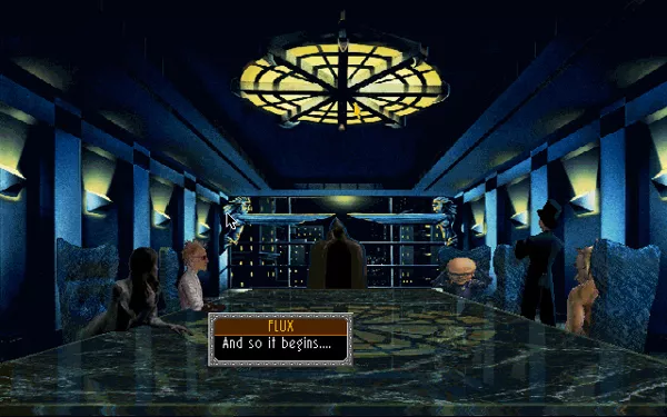
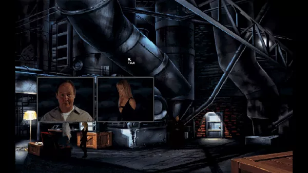
Noctropolis is a puzzle-solving adventure game, with game mechanics similar to Sierra and LucasArts titles belonging to the same genre. Controlling Peter, the player has to interact with characters and objects, manipulate inventory items, solve puzzles and overcome the obstacles the main character will have to face to advance the story. The game has a verb-based menu interface that appears if the player right-clicks on the screen. It features live actors filmed over digitized graphics; many conversations and cutscenes are displayed as short movies shown inside a smaller screen.
Groups +
Screenshots
Promos
Videos
Add Trailer or Gameplay Video +1 point
See any errors or missing info for this game?
You can submit a correction, contribute trivia, add to a game group, add a related site or alternate title.
Credits (DOS version)
78 People · View all
| Design | |
| Written By | |
| Producer | |
| Associate Producer | |
| Assistant Producer | |
| Music and Sound Effects | |
| Artwork Direction | |
| Art and Animation | |
| Technical Art/Video | |
| Technical Director | |
| Programming | |
| QA Project Leader | |
| QA Supervisor | |
| QA Testers | |
| [ full credits ] | |
Reviews
Critics
Average score: 68% (based on 21 ratings)
Players
Average score: 3.7 out of 5 (based on 38 ratings with 5 reviews)
The Good
Noctropolis has extremely well-developed comic-like characters, beautiful backgrounds and not only that. The acting is pretty good (for a computer game). The game appealed to me for its dark atmosphere and characters (which reminded me a lot of batman); its plot and graphics (a special mention for the comic-book drawings).
The Bad
It was a little short for my taste which is why I wish there was a sequel (the ending allowed one perfectly).
The Bottom Line
It's a great adventure game with a lot of borrowed elements from comics and movie culture which makes it very enjoyable and appealing to a wide range of players (except for little children, there is a some sexual content, but nothing really explicit)
DOS · by n-n (50) · 2000
The Good
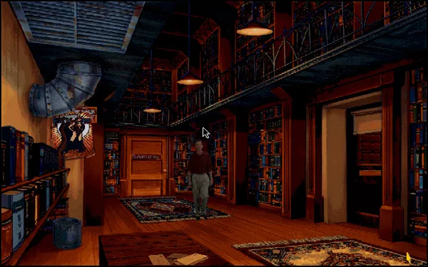
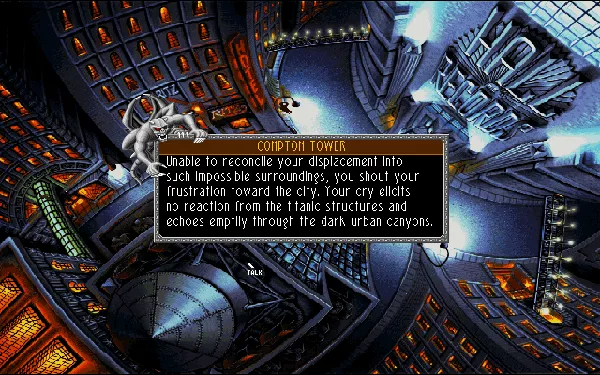
The best of the game's graphics are really beautiful. Yes, their quality is uneven - some places, such as Cygnus lobby or, especially, the extremely boring and ugly Hall of Records, are a real failure. But the majority of places look very captivating. The artists clearly know how to use untypical perspectives to enhance the mood - the game has an overrepresentation of more or less sharp top-down views, which make the area look oppressive. The protagonist's silhouette is often very small compared to the surroundings, which makes him seem lonely in face of a looming danger.
The game also uses something I very much enjoy: it temporarily switches to a different graphic style. I mean, of course, the comic books. They use a typically cartoonish style and, in order to obscure as little picture surface as possible, don't have speech bubbles like ordinary paper comic books. Instead, all dialogue and other text is displayed by clicking on pictures.
It's just a huge pity that in this respect, the game promises more than it delivers. Instructions on how to read comic books - specifying, for example, that text is displayed after clicking pictures - are even found in the game manual. This can make players think that there will be several comics to read. And the truth is: nope, there are just two, both at the very beginning of the game.
The Bad
The story has some interesting aspects, but it doesn't appeal to me very much. It seems rather banal to me and, first of all, cut short. We don't even meet all of the villains. It seems to me like the game could have been planned bigger, or could have been planned as the first part of a series - but all that remains of the plans is this one game. So basically, we are offered a short introduction into the "Darksheer universe" and then we enter that world... and still only get to explore it in part.
I hugely disliked the way Stiletto "uses her feminine charm" to create a diversion. This is just caricatural and I felt that she humiliated herself. It's just extremely unappealing to me as a woman who isn't interested in being attractive to men, prefers to be categorical instead of "charming" when talking to them, and would rather starve than cater to men's inflated "needs".
However, the biggest flaws of the game are found in the area of gameplay. The game uses a variant of a verb interface - the right mouse button pauses the game for a while (which is a very good idea by itself) and displays a triangle (or "pyramid", as the manual calls it) divided into several fields with commands. It includes typical commands such as "talk", "open", "move", but also "travel" (access to game map, so more than actions within the immediate surroundings) and "disk" - which accesses the save/restore menu. The bad thing is that it uses no simplifications common for adventure games. For example, to enter a room, we usually need to, first, choose the "open" command and click it on the door, and then do the same with the "go to" command. And the worst thing: unlike a lot of adventure games (think, for example, of "Lost Files of Sherlock Holmes" as an example among older games and of "Mage's Initiation" as one among newer ones), the game doesn't display names of objects until you click them. So it means lots of pixel hunting... I have already mentioned the Hall of Records as a very ugly room. And indeed, it's an almost monochromatic room with a counter of a ridiculous, caricatural size, and the clerk only visible as a tiny black silhouette. It's really hard to find him in the picture, the Hall of Records at first looks like there's no one there.
Because of this lack of captions, items which can and often should be taken pose a similar problem. With no names of objects displayed by just moving the cursor around, they are hard to spot. And they often stand out very little. Highlighting useful objects has always been a bit of a problem in classic adventure games, attempts to solve it often lead to them standing out in a somewhat unrealistic way (think of the VGA remake of "King's Quest 3", with fairly colourless objects on the shelf - and one big bright blue bowl...). In "Noctropolis" objects stand out very little and are easy to miss.
The Bottom Line
Still, I think that the game has some interesting ideas, a story which could be captivating... But as it is, it's a fairly disappointing game. The story seems just unfinished, half-baked, and the gameplay is very uncomfortable because of lack of captions, small and hardly visible objects and a tendency to distort perspectives so much that people to talk to become hard to spot in those huge interiors. I understand that it's hard to find a balance between items being visible and almost screaming "Hey! I'm here!", between creating offbeat, interesting perspectives and ensuring that these perspectives don't make important objects or characters effectively invisible... Unfortunately, "Noctropolis" goes in the direction of creating original perspectives and a realistic appearance of objects so much that it hardly cares about the functional aspect of the game. So the game can be interesting, but is very uncomfortable to play. It almost looks like the developers had made a checklist of mistakes in creating seamless gameplay and worked hard to include as many as possible...
Windows · by Nowhere Girl (8782) · 2021
Goodbye, Darksheer. Hello, Darksheer
The Good
You are Peter Grey (played by Michael Berger), a huge fan of the Darksheer comics, set in the fictional city of Noctropolis and starring a range of characters including Tophat, Greenthumb, Stiletto, and Darksheer himself. After reading the newest issue, a courier knocks on your door and sends you a mysterious package. Upon opening it, you discovered that you are a winner of the “I Want To Be Darksheer!” sweepstakes that you entered in the past. That package causes you to be transported to Noctropolis as Darksheer, even though the real one disappeared several weeks.
Noctropolis is an adventure game that plays similar to the likes of Tsunami's Blue Force and Sierra's Gabriel Knight: Sins of the Fathers. Right-clicking the game's yellow cursor brings up a series of commands that are embedded in an inverted triangle. This is a nice feature. Even I could not fill a triangle with a limited size with many commands. You will spend most of the time talking to characters, usually changing how the way the conversation is going. At times, a piece of honeycomb appears on the screen, with its sections representing people that you can ask about. This feature is also neat. When I previous played adventure games that require you to ask characters about others, you are just given a list of words, so I am glad that the ask box is in form of a graphic.
In Noctropolis, you meet both good and evil characters, both voiced by some of the game's developers as well as outside actors. Owen Richardson, who lends his voice to at least three characters, does a superb job of playing Flux, Dealmer, and one of the coffin movers. Other characters, such as Jim Drake (Thomas Milan), have quite a temper if you happen to say the wrong things. The Elemental (Shaun Mitchell, another of the developers) sounds good, too. One character that I like was the butcher (Gene Ray) with his personality. If you upset him, he will get angry and decide to take it out on an innocent piece of meat.
Noctropolis is mainly aimed at an adult market. There is nudity gore, and violence. An example of this is at the beginning of the game where the player sees a cut-scene that sees Peter watching television when a vampire comes and sits on Peter and undresses. Violence is near the end of the game and involves a character known as Master Macabre (Anthony Russell) being stabbed by Stiletto (Hope Marie Carlton) for revenge against Macabre deciding to cut her finger off. The resulting scream can be terrifying. ELSPA gave this an 18+ rating, which is definitely too much for a game that does not contain sex scenes or over-the-top violence.
Although you can only do this at the start of Noctropolis, I quite enjoyed reading the two issues of Darksheer, one was about the aforementioned characters vowing to end Darksheer's life; the other was about Stiletto giving up her career as Darksheer's sidekick. There is quite some energetic music when one of the action pages kick in. But without reading the comic book, the music in the rest of the game is quite good, and can be described as easy listening or quite smoothing. One sound effect that I liked was the chime when you pick up something.
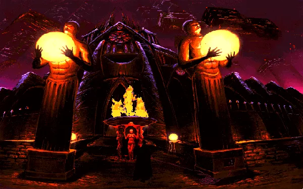
At the moment that you stepped into the world of Noctropolis, I noticed that some of the scenes look like they have been taken right out of the comic book, and some scenes are more breathtaking than others, with major locations surrounded by skyscrapers that make up the city. At times, I felt that I was actually playing an adventure game set in the future, rather than the present. I like the idea of setting the game only at night, since Noctropolis is only set at night, like in Rise of the Dragon, as well as the games in the Tex Murphy series. What I like more about the graphics is seeing an overhead view of Noctropolis when you are traveling between locations, as well as watching the activity of Main Street (also in bird's-eye view).
There are some puzzles in the game, but they are not too hard for the player to figure out. Most of these puzzles require you to do certain tasks within a strict time limit, and some of them require precise timing on your part. The puzzles can take five minutes or more, depending on your knowledge of it.
The Bad
I prefer playing a decent adventure game without puzzles, especially complicated ones. I do not like to waste my time. There are a couple of hard puzzles, and one of them involves you arranging the pegs in a circle in order to open the door.
The Bottom Line
Noctropolis tells the story of Peter Grey who is transported out of the real world and into the fictional city of Noctropolis after winning the sweepstakes. There, he will meet characters that will go out to kill him, as well as those who are trying to protect him. The music is excellent, especially when reading those action-packed comic books, and the superb graphics look like they have been taken out of a comic book. As I said before, Noctropolis is an adventure game for adults, and it is not recommended for anyone under 15 years.
DOS · by Katakis | カタキス (43085) · 2006
Trivia
When released this game caused some measure of controversy because of its violence (which isn't that much really) and sexual situations. Also this game is the only "mainstream" game (at least to my knowledge) to include a live-action video sequence with a topless actress (your admitedly very hot partner, Stilleto) in addition to other suggestive/erotic sequences.
Analytics
Related Sites +
-
Crapshoot
A humorous review on PC Gamer -
Noctropolis Fansite
One of the few (if not only) fan sites dedicated to the game. Contains bios of the main characters, a walkthrough, an interview with designer and writer Shaun Mitchell and some game media.
Identifiers +
Contribute
Are you familiar with this game? Help document and preserve this entry in video game history! If your contribution is approved, you will earn points and be credited as a contributor.
Contributors to this Entry
Game added by MAT.
Additional contributors: Zovni, Afterburner, Gonchi, Patrick Bregger.
Game added May 28, 2000. Last modified August 2, 2024.


